The Coming The Second Wave - Demand Pull Inflation
A conventional economic paradigm for unconventional times. "Quantamentalism" unleashed!
With old inflation riding the headlines, I have read till I am bleary-eyed, and I can't get head from tails of the whole thing. ... Now we are living in an age of explanations-and plenty of 'em, too-but no two things that's been done to us have been explained twice the same way, by even the same man. It's and age of in one ear and out the other. - Will Rogers
Disclaimer: the strategy of this article is to overwhelm the reader with visual data supporting the second wave inflation thesis. Feel free to scroll to the conclusion for a more concise summary.
Types of Inflation
Let’s start with the basic terminology…
Cost Push Inflation - A decrease in the supply of goods and services relative to the money supply causing a degree of scarcity and short term higher prices. A generally acute effect.
Demand Pull Inflation - An increase in demand relative to supply. This is typically caused by human behavior and change in wants in the micro economic sense. In the macro economic sense, it’s the result of an increase in the supply AND VELOCITY of money.
In recent memory, we saw cost push inflation emerge in 2021 primarily to due to the shortage of goods produced during COVID lock downs of 2020. Many people assumed this was the result of stimulus (and to some extent it was), but the household savings rate went up and velocity of money went down. Liquidity was in the system but the public, in general, sought to tighten its belt due to the uncertainty of future employment and duration of lock-downs and economic disruption. Then there was the FEDs secret weapon, the Overnight Reverse Repurchase Agreements (Temporary Market Operations). Or, FED Reverse Repo for short. Here is a picture of the balance of that account over time:
Why did ORR suck so much money out of the economy? It’s relatively simple. The reward for ORR was 5bps higher than the fed funds and short term treasury. Large institutions got a liquidity dump, then subsequently offered 4%+ to park that money at the fed in exchange for treasury collateral. Money poured in and artificial demand was created for USD. The vehicle provided a high risk free rate. This proved damaging to the EURUSD in the short term. USDEUR in blue and ORR in orange below.

A few things can be observed from the cost push era. First, the effects of higher prices were far less severe in the United States due to the roaring dollar. We should consider the implications of the remainder of this article in an era where the dollar is falling compared to other currencies. This round of inflation could be far, far worse and long lasting. Second, the decrease of 2 trillion dollars originally withheld from velocity in the ORR could impact the USD fairly significantly. Where did this money go (cough… AI stocks)? That is the question.
We should consider the implications of the remainder of this article in an era where the dollar is falling compared to other currencies. This round of inflation could be far, far worse and long lasting.
History as a guide…
It’s often been said, history doesn’t repeat, but it rhymes.
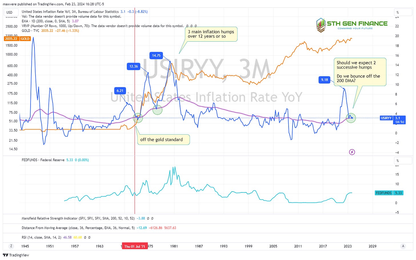
For a visual long term history of CPI (Consumer Price Index) observe the blue line below. In the 1970s CPI recorded 3 distinct peaks of year over year inflation. The actual content calculation of the CPI has changed over the years to suppress the real rising costs, but the targets and way the statistic used and applied has not.
Observe the near perfect return to the top of the 200 DMA (purple line). We observe a few similarities.
The 200 DMA is upwardly sloped
The price of gold (orange line) increased ahead of the first 70s spike in spite of the US gold standard at the time (delivery wasn’t available to the retail public). This supports the theory that gold price precedes or “sniffs” inflation out.
The subsequent peaks were increasingly higher (worst is yet to come outlook)
Fed funds rate (light blue at the bottom) ultimately squelched the nearly 15% year over year, however, it got up to 18%!
Wave 1 (1970) Fed funds increased to 8-9% to stop a 6% y/y. We only saw an increase to 5% as response to 9% year over year.
The peaks (a lagging indicator) are roughly 3-4 years apart.
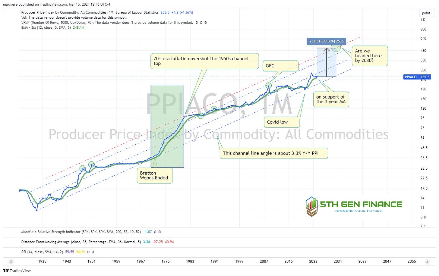
What about PPI (producer price index)?
Producer price index is the relative price of commodity input costs.
From COVID lows to the 2030 area, we could see 150% increase in producer prices. The trend is only 38%. That’s if we repeat the 70s and squash it with 18% interest rates!
What Are Interest Rates Telling Us?
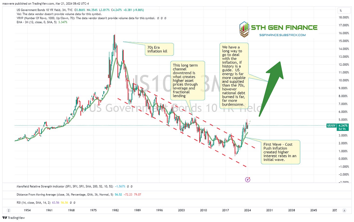
Long term picture
Get out of floating debt, NOW! (credit cards, ARMs and debt where interest rates can rise on you) For many people that means new habits, new skills etc. My guess is we don’t see the interest spikes of the past because:
we can’t afford them on a soveriegn or consumer level (downward political pressure)
higher inflation might actually be less painful and the easier path to choose given the current cultural fortitude of our society
The FED will need to balance two undesirable outcomes. They no doubt will come up with some third option to defer/manage pain toward future generations. But, that remains to be seen.
Near term picture
In the short term, it seems the market trends toward about 180 bps (1.8%) impulse moves on the 10 year treasury. The next one, possibly in 2024, takes it to 5.6%. More importantly this suggests 30 year mortgage rates will push 7.5%-8%. Lately, real estate agents have been promising the option to refinance at lower rates when these “temporarily high” mortgage rates come down. How many new home owners are at the debt margins because the expected lower rates? When does the real estate market lose hope and capitulate to future higher financing cost?
It doesn’t get better in the banking and finance sector. This part of the story is deflationary. A banking collapse will “help” the oncoming inflation, if it were allowed to occur. Banks are currently holding bonds issued and purchased at much higher prices than current market offerings. The worst ones did this at a high leverage rate. Shoes will drop, most likely in 2024. How does this play out? Bullish risk off assets. Bullish gold.
Owe the bank $100,000 and the bank owns you. Owe the bank $100,000,000,000 and you own the bank!
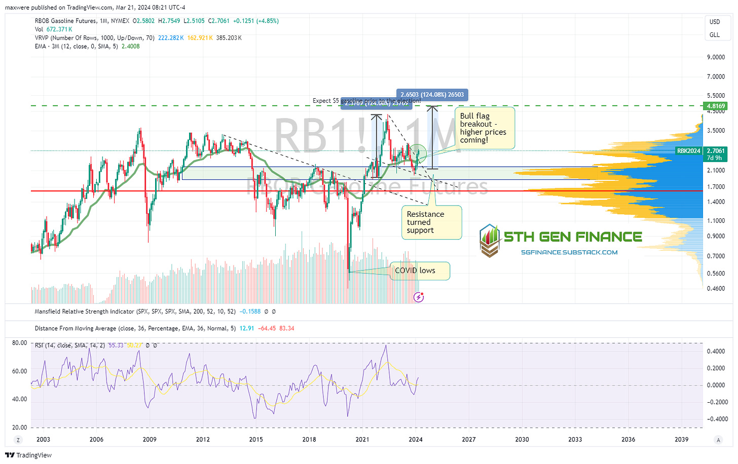
What will the price of gas be? (Bullish)
If this inflation scenario plays out, how much will you pay at the pump? Short answer is, its already going higher. The chart says you will pay $5 or so by mid summer. I think a $10 spike could be in play based on the chart, but domestic oil supply and political pressure will put loads of downward force on an upward move. $5 is enough to spark domestic outrage and all kind of political subsidies and manipulation. The public will be keenly aware that inflation is here to stay. The reality is, we are all short gasoline, we should get long one of its underlying assets. Bullish oil and conventional energy stocks.
What Are Current Commodity Prices Telling Us?
1. Gold (Bullish)
Gold “Heikin Ashi” chart where each candle represents 1 quarter of price action. Heikin Ashi candles more clearly identify the bull markets with the prevalence of green bars against red. With such a high time frame view you can see how far gold can rise this decade to simply repeat the conditions of the 2000s era.
Zooming in…
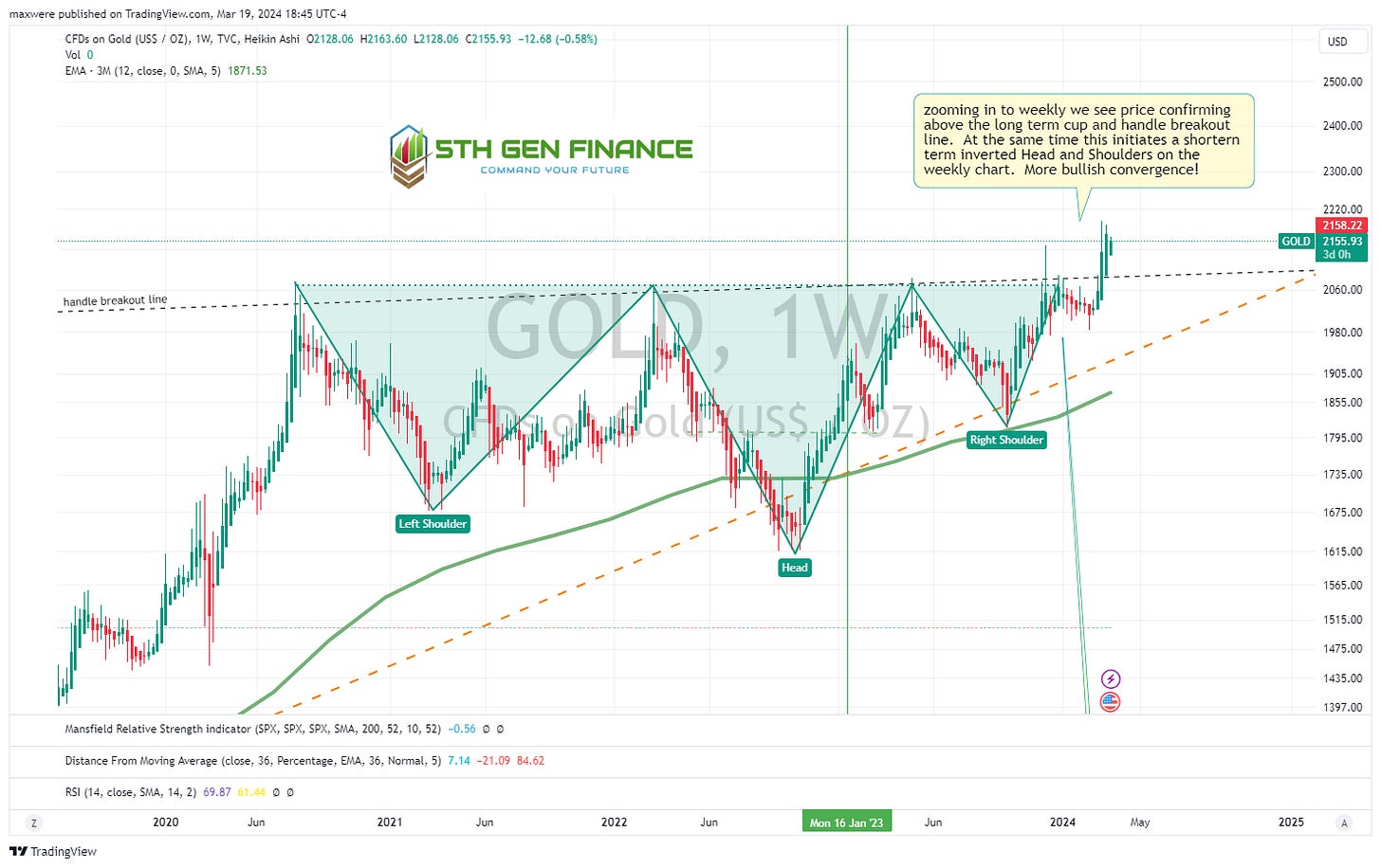
The weekly HA chart gives more bullish evidence. We are in week 3 above the long term trend line and holding this level. A monthly/quarterly close is handwriting on the wall for Gold.
2. Silver (Neutral - On the Verge)
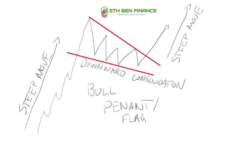
Before we move further its a good idea to get a common bullish continuation pattern in our minds. Below is the bull flag (pennant). Traders often train very specific rules on its definition, but for the purpose of illustration and impression, simple train your eye to see steep up move followed by contained downward period of consolidation (the flag/pennant/triangle), followed by a breakout, usually indicates a symmetrical steep move similar to the first one. Another name for this completed pattern is ABDC.
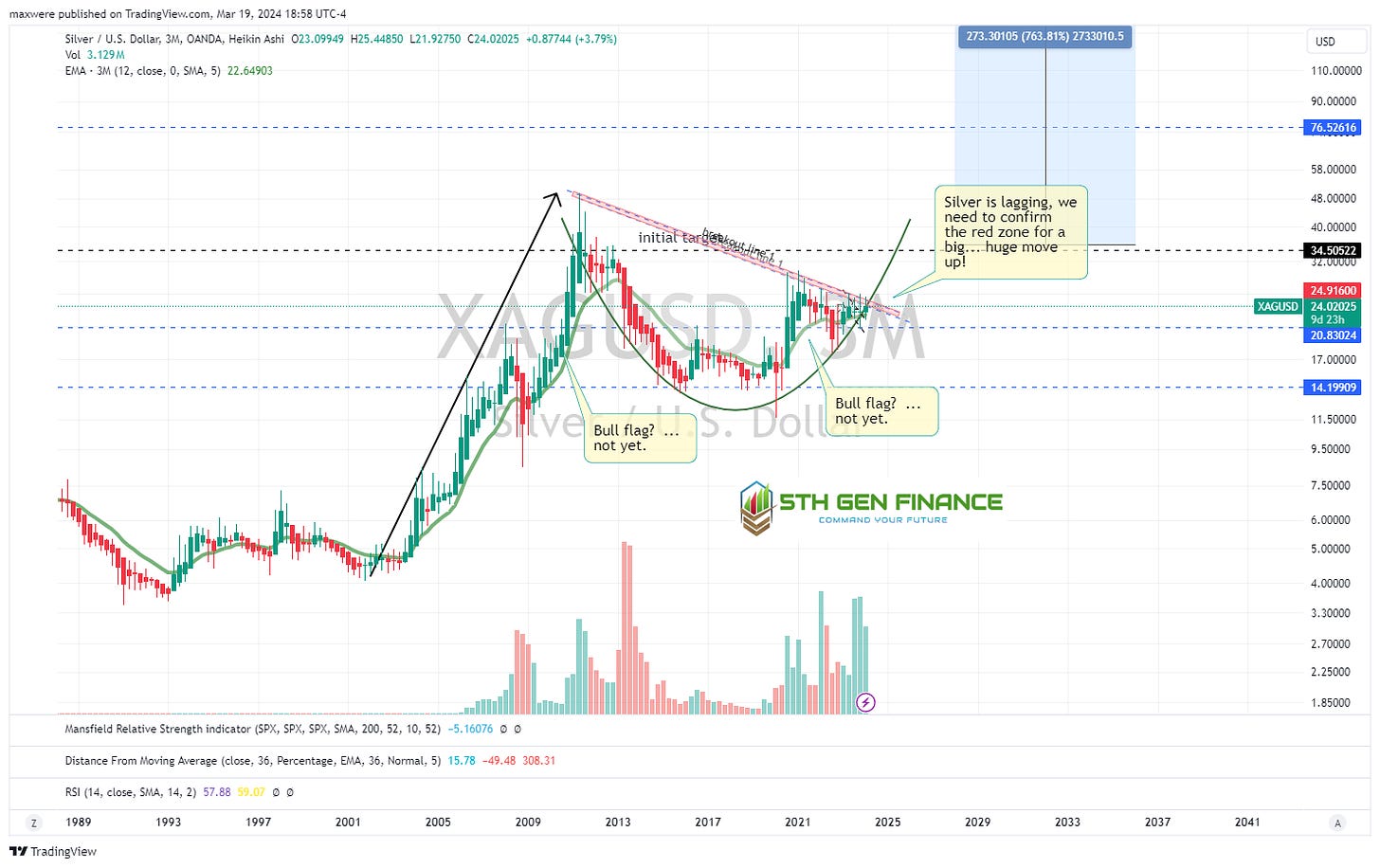
Now on to silver. Hopefully if glance at the sketch above, you will likely see several fractals of the bull flag below. A bull market has not been confirmed yet, but something has to give soon! The chart targets silver prices at completely astronomical levels. The point of this article is that the evidence looks like it is ready to pop!
Silver to Gold ratio. This chart will breakout when a precious metals bull market is underway:
3. Copper (Bullish)
Switching back to traditional candles (for clarity), copper chart is breaking out. Symmetry suggests $8 target range in the second half of the decade.
4. Platinum (Neutral)
5. Palladium (Neutral - Early Basing?)
Palladium experienced a major crash over the last year (likely due to high Russian inventory flooding the market combined with low auto sales). The last few candles and high volume suggest a bottom is in. Fundamentally the price is below the cost curve.
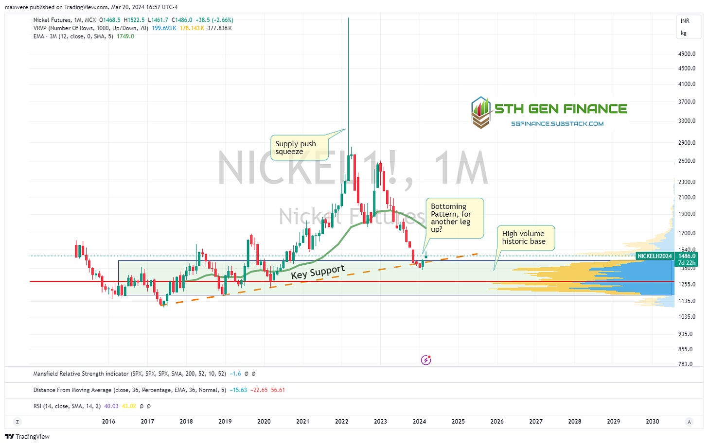
6. Nickel (Neutral - Basing)
Another commodity where supply filled from Russia…
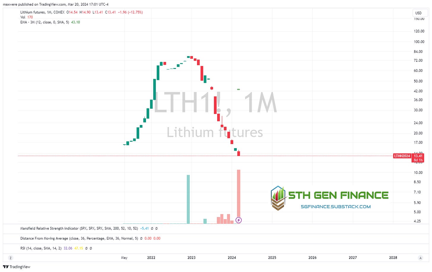
7. Lithium (Neutral - Falling)
Bubble over?
Energy
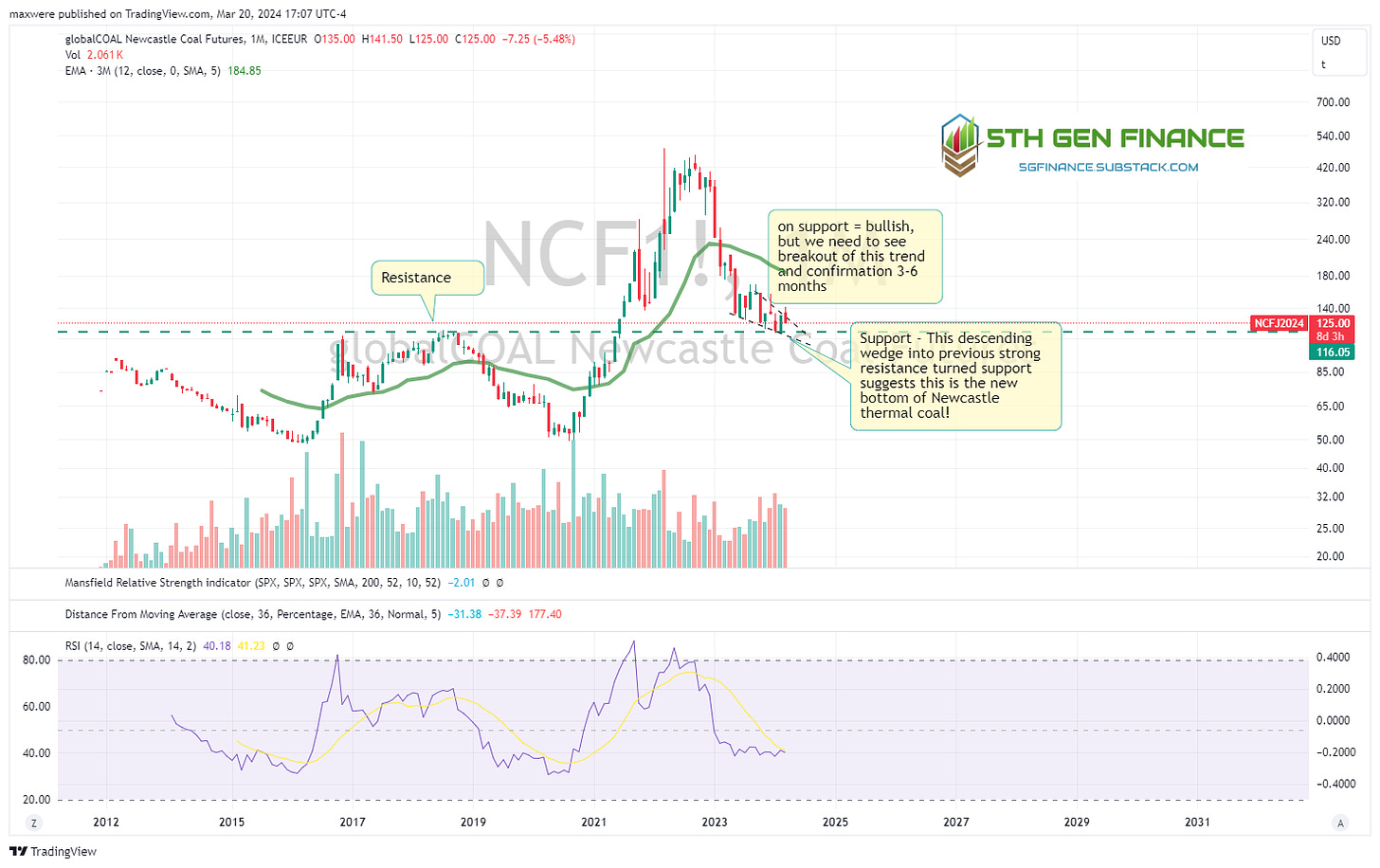
8. Newcastle Coal (Neutral - Basing)
9. Rotterdam and Richards Bay Thermal Coal (Neutral - Basing)
10. Indonesian Thermal Coal (Neutral - Possible Bull Flag?)
11. Oil - WTI (Bullish - Breakout)
Oil looks to breakout from its bull flag this month. Just with the eye test alone, that should send prices near a touch of $115 or so. US Oil inventories are currently around average. Supporting the idea that this move is “demand pull” related.
14. Oil - Brent (Bullish - Breakout)
Same pattern as WTI essentially.
15. Natural Gas (Bearish - Falling Knife)
Not much to take away here other than the price is about as low as it can economically exist and the historic levels bere that out.
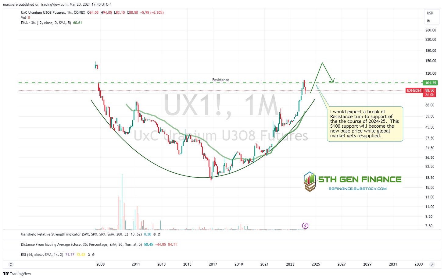
16. Uranium (Bullish)
Base Metals
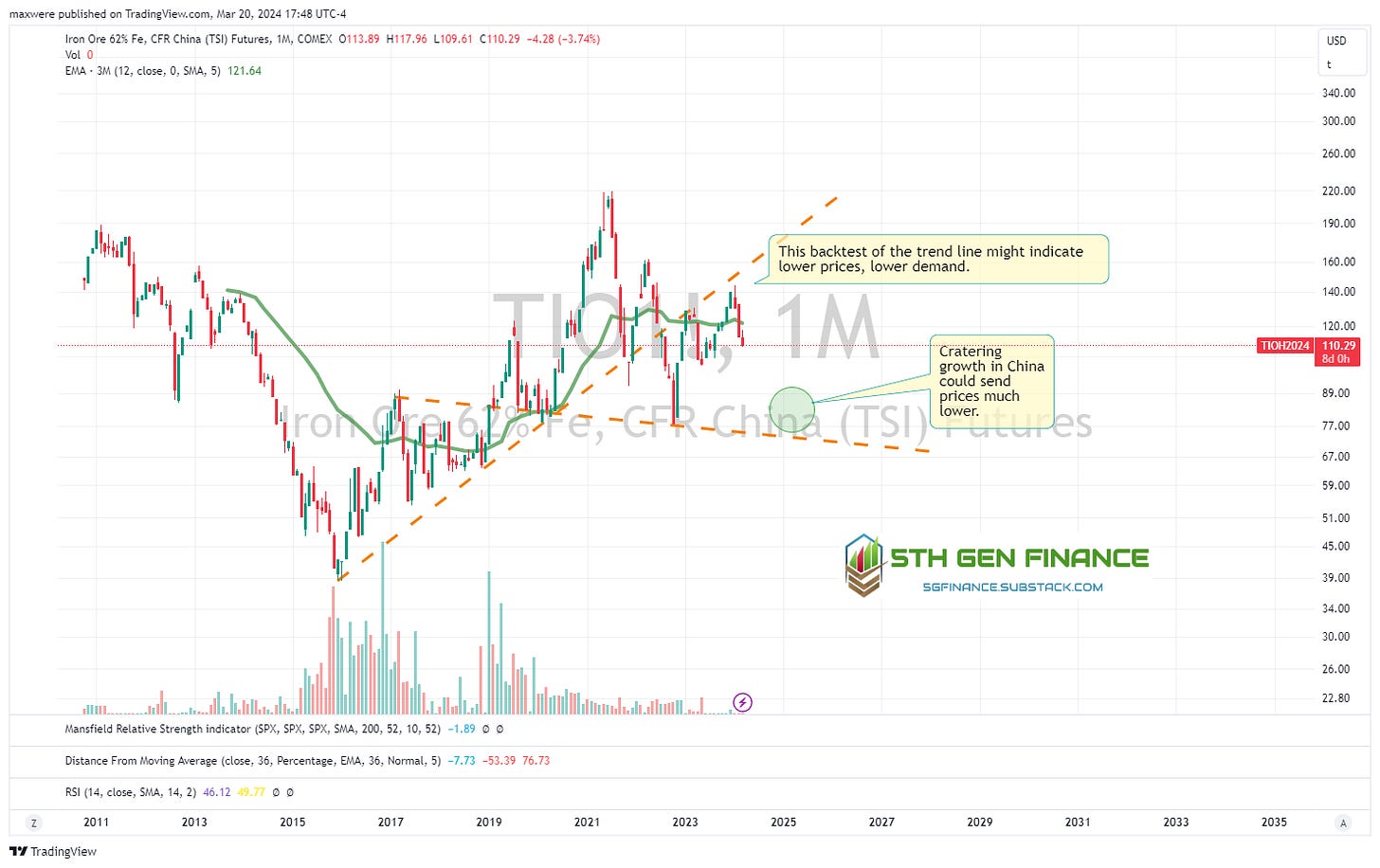
17. Iron Ore (Bearish - Falling)
This is the only chart of the bunch that looks like it could drop 20-25% or so. If the Chinese or other emergent economies struggle, this is what one would expect. …slower growth in the infrastructure/real estate sectors.
18. Aluminum (Neutral - Basing)
Another possible bull flag. Another previous resistance turned support type setup.
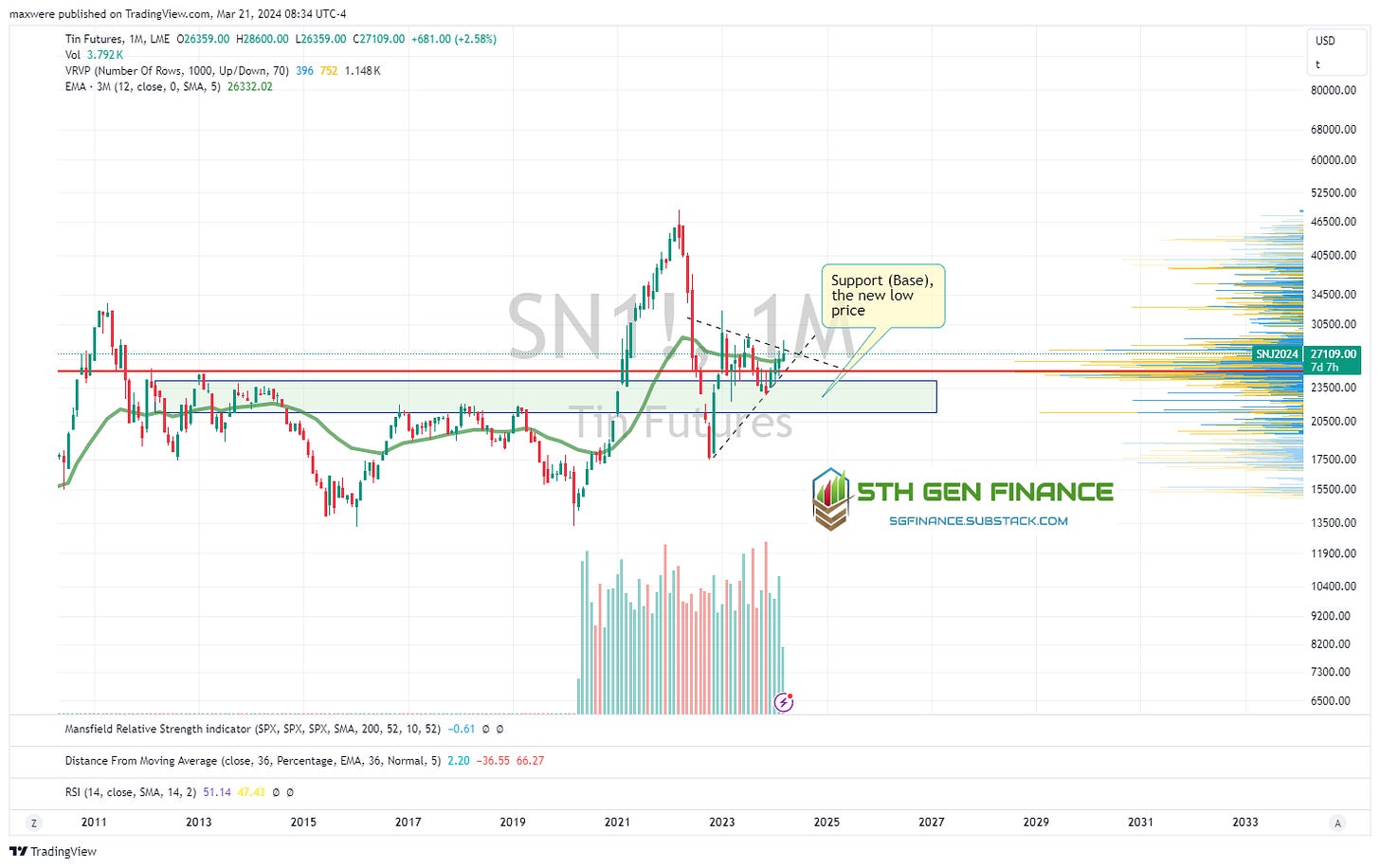
19. Zinc & Tin (Neutral - Basing)
RSI and trend line suggest this may be a higher low cycle bottom. Both of these look like coiled consolidation on higher lows (new normal “low” prices).
Agriculture
20. Corn (Neutral - Basing)
Another chart sitting on top of key support.
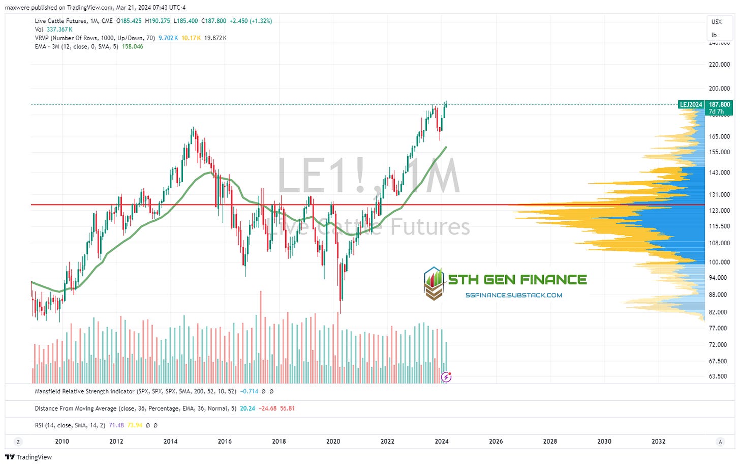
21. Live Cattle
This chart is out of control already. I don’t see it slowing down. Not great news if you like red meat!
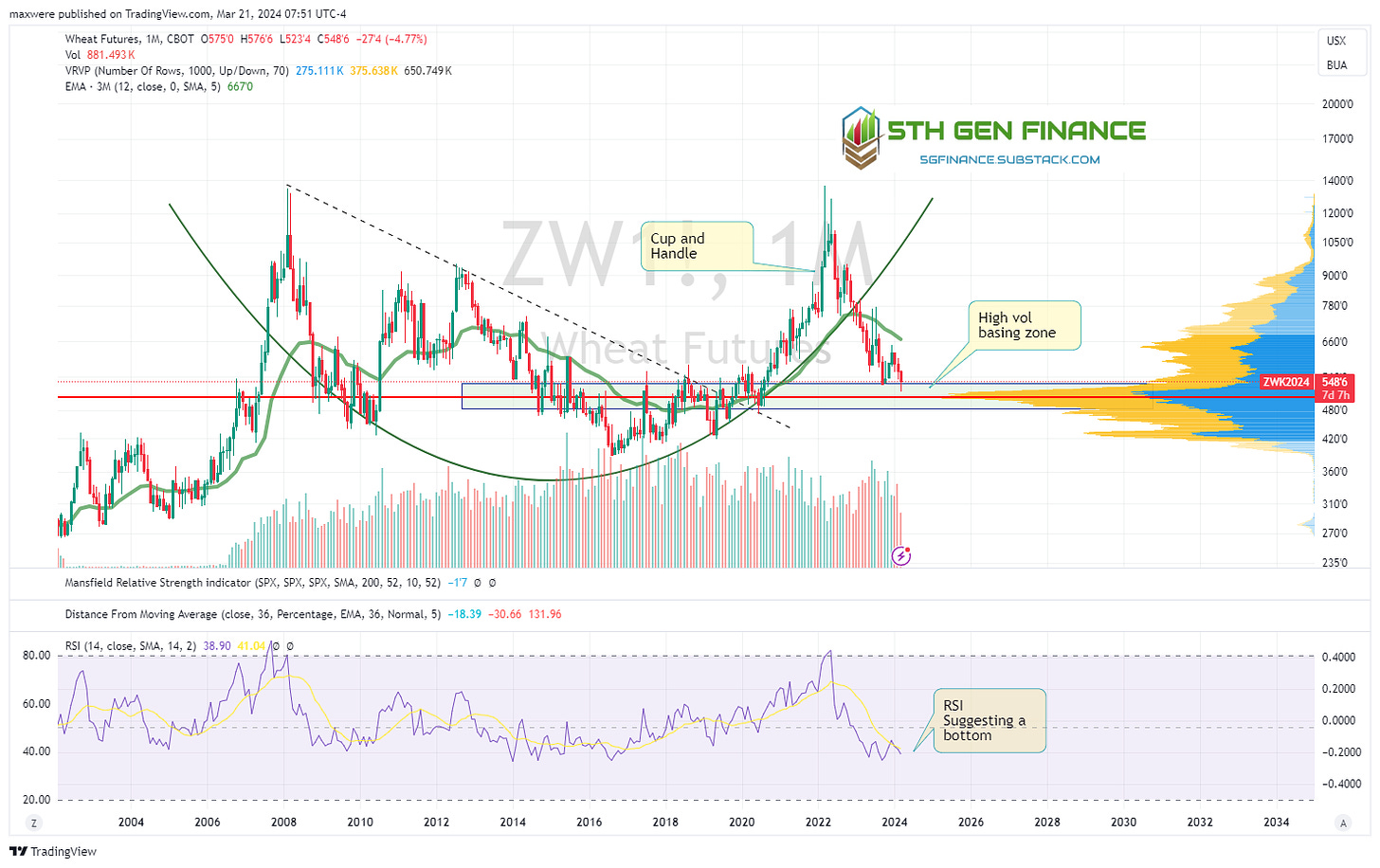
22. Wheat (Neutral - Basing)
This is the same look as corn (20). Both cup and handle patterns with the handle retraced back to the top of key support.
23. Soybeans (Bearish)
This chart alone suggests the pullback will continue. But our friend the bull flag may make and appearance over the next 24 months.
24. Lean Hogs (Neutral - Basing)
25. Cocoa (Bullish - Parabolic)
Long consolidation followed by a blow out. Only commodities with tight supply strains will see this kind of hyperinflation. So, I wouldn’t attribute this move to demand pull, but cost push scenario in this particular sector. The pattern is a relavent study to give us an idea of when a blowout can happen.
26. Sugar (Bullish)
In a long term uptrend, currently backtesting support. Chart suggests higher prices.
27. Cotton (Neutral - Basing)
Conclusion and How to “Long Reality & Short Idiocracy”
In my view the future is one where liabilities cost more to maintain and assets cost more to acquire. Or, put another way, the stuff you own (car) is worth less and the stuff you need (gas) costs more!
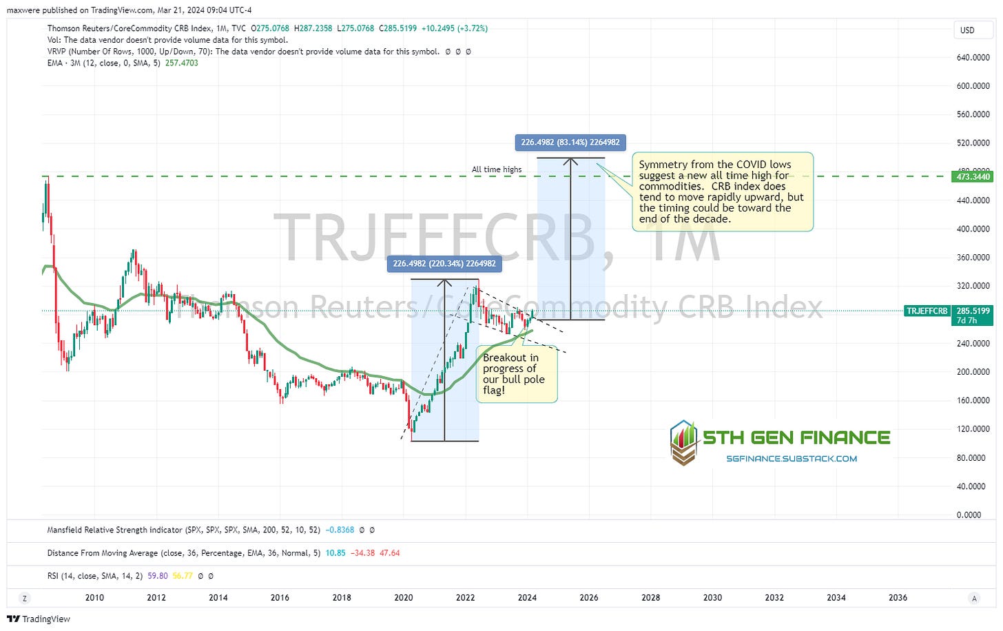
Congratulations if you looked at every single one of those charts (and thank you)! If not, let me summarize. 2/28 charts were bearish or suggested lower prices. The remaining 26/28 were on support or suggesting a breakout move to the upside, some very significant! Some call this the beginning of a commodity super cycle. The whole thing can be summarized in the following commodity index chart. As of this writing the last candle has not closed and confirmed a breakout, but it looks imminent. If so, it suggests all time high commodity prices in USD or your favorite commodity is likely on the way.
How to position yourself in a net long position
A simply summary of what asset classes are setup to hedge the demand pull problem can be listed from least risky/volatile to most. Your position size should be more weighted to lower volatilty, but that is a conversation between you and your financial advisor. (2, 4, 6 and 7 below are income generating investments)
Physical Gold
Rolling short term treasuries (< 2 years, to the extent that yeilds stay above 5% and you can capture higher rates as they emerge)
Physical Silver
Large cap Oil and Gas stocks and high quality royalty plays and midstream companies
Physical Platinum and Palladium
Large cap materials and mining companies (base metals and copper)
High quality coal companies
Small cap Oil and Gas
Gold, Silver and Platinum mining companies
Uranium Equities
Large cap agriculture
Bitcoin (use descression not to enter in hype cycle)
Invest in inflation. It is the only thing going up. - Will Rogers


